UX Designer | Human Computer Interaction
Wholefoods Visual Design Project
Creating a design language
For this studio project, we were tasked with choosing one of four brands and redesigning their design language.
The project could not be a website.
The scope included:
-
Creating a visual strategy and moodboard
-
Translate the visual strategy into a working design language
Deliverables:
-
6-8 screens, spanning multiple device types
-
2 non-digital executions
-
2 mockups
We were to undergo several oral critique sessions, ending in a presentation.


Design Phase
iPad & Mobile Screens
I wanted to think about what users might want from a recipe app as well as what Whole Foods as a company might want to include.
I decided to create the following pages:
-
Browse
-
Recipe Overview
-
Recipe Detail
-
Pantry
-
Ingredient Detail
One of the key tenants for this project was iteration. I kept track of all of my iterations as I went to ensure that I could explain my process and to prevent destructive changes that would take time to fix.
At each of three checkpoints, I met with my professor and classmates to discuss my progress, show the current state as well as key iterations, and get their feedback.
Visual Strategy
I first did a cognitive walkthrough of Whole Foods' site to determine where the major flaws were. I also read Whole Foods' mission statement and list of core values.
I decided to focus on the following three phrases that came up frequently in their branding and seemed to highlight their mission:
-
High Quality
-
Natural and Organic
-
Exciting, Fun, Satisfying, Delightful
knew that I wanted to create an iPad and mobile app that would integrate recipes with Whole Foods' branding, so I searched for inspiration online from food bloggers, instagram, etc.
I decided to keep a neutral background palette, letting the food speak for itself.
I also wanted to draw in elements from their in-store branding, such as their chalkboard displays.
Finally, I wanted the food to be the star, so I wanted to include artistic food pieces as well.

iPad App inVision Prototype
Icons drew inspiration from chalkboard displays in Whole Foods' stores.
Photos are high quality, vibrant. Given a 3-dimensional treatment, they make Whole Foods' ingredients feel tangible and exciting.
Ingredients are emphasized with a fun visual, but text instructions are neat and easy to read.
User interactions are meant to feel like part of an experience. Users are able to select chalkboard icons and swipe to rotate a circular menu.
Each step of the recipe is its own page with easy click or swipe access to return to a previous step. This way, instructions don't overwhelm and the experience feels immersive.
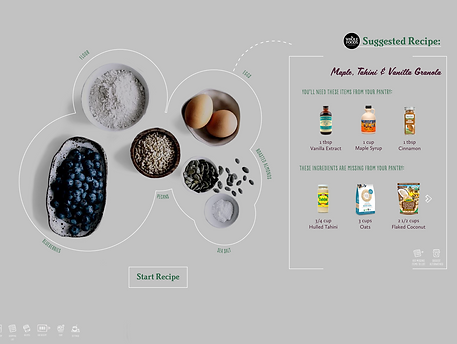
Users have the ability to add items to a pantry when the shop at Whole Foods or elsewhere. They can then check if they have an ingredient in stock or add it to their shopping list.
Mobile App inVision Prototype
Less recipes or categories are shown on a page so that users can read more clearly.
The navigation menu has been removed while in a recipe for visual clarity.
There is now a sticky navigation at the bottom of the screen.
Users can still swipe on the circle menu to see other recipe options, but the choices are simplified.
Design Phase
Smart Countertop
We were asked to think outside the box and create a design language that spanned multiple devices as well as digital and non-digital. I thought of creating a smart countertop interface that would allow users to access recipes, determine if they have ingredients, and add them to their shopping list, all from their kitchen counter.
My countertop, based off of inspiration from companies like Ikea and GE, would recognize ingredients and suggest recipes. Users can add missing items to their shopping list or ask it to suggest alternative recipes. They can also scan their recent shopping receipt to add items to their pantry.


Next Steps
I would like to spend more time on the mobile version. Right now, I mostly took the iPad version and adjusted it to mobile proportions. However, I think there is work to be done in making that experience cohesive. For example, I would like to find a way to integrate navigatioin into the recipes pages on mobile.
Additionally, I feel there are areas of the visual design on both devices that could be simplified or made clearer.
I would also like to go back and animate the more unconventional scrolling methods, like the circular menu. I think there arer more areas that could be pushed to be more exciting and interesting for the user.